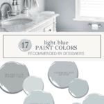
The Best Light Blue Paint Colors for a Fresh Look
Discover the best light blue paint colors for a fresh, airy look. From soft blue-grays to breezy coastal hues, find the perfect shade for any space.

There’s something about light blue paint colors that feels both refreshing and classic. Whether you’re after a serene bedroom retreat, a breezy coastal-inspired space, or a soft hint of color in a neutral home, the right light blue can transform a room. Light blues with gray or green undertones offer versatility and sophistication, making them a favorite for interior designers and homeowners alike.
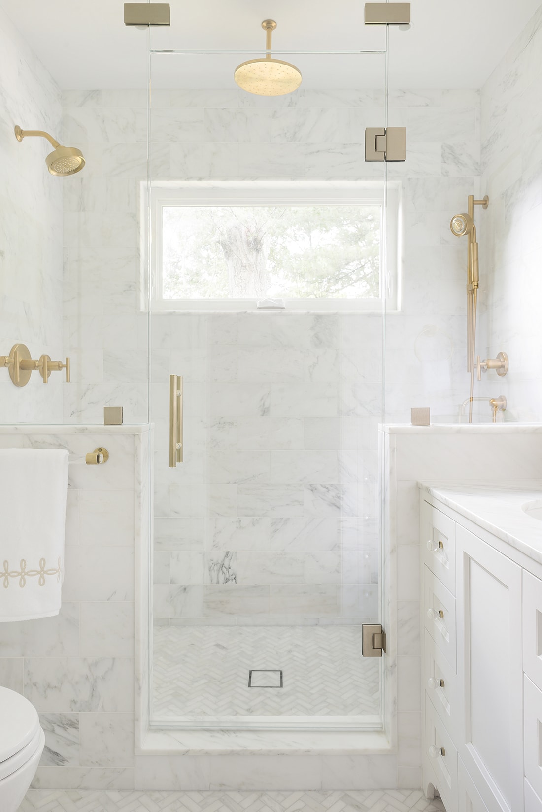
Following the reveal of my daughter’s bathroom, I’ve gotten a lot of questions about shades of blue. Today, I want to help gather some inspiration and point you in the right direction of some of my favorite light blue paint colors.

While I wouldn’t use a light blue for my entire home, I will use various blues throughout my entire home. Blue walls, blue ceilings, blue cabinets… blue paint colors are infinitely versatile!
The Best Light Blue Paint Colors
1. Sherwin-Williams Krypton (SW 6247)

- Undertones: Cool blue with a touch of gray
- Why I Love It: Krypton is one of those rare blues that feels light and airy while still having enough gray to keep it sophisticated, so that it doesn’t read baby blue. It’s beautiful in spaces with a lot of natural light and pairs effortlessly with either crisp or creamy whites.
- Best Pairings: Pure whites, warm whites, fun contrast with navy accents
- Similar Popular Colors: Sherwin-Williams North Star SW 6246 (a slightly lighter version of Krypton)


2. Sherwin-Williams Silver Lake (SW 9633)

- Undertones: Muted, silvery blue with cool gray tones
- Why I Love It: Silver Lake was a high contender for my daughter’s bathroom. It leans slightly cool, as well, but is a bit more saturated than Krypton and has more green undertones.
- Best Pairings: Soft whites, light grays, charcoal accents, lovely with marble tile, too!
- Similar Popular Colors: Benjamin Moore Silver Gray 2131-60 (a bit lighter than Silver Lake) and Sherwin-Williams Sleepy Blue SW 6225 (a hair lighter and less gray than Silver Lake)
3. Sherwin-Williams Silvermist (SW 7621)


- Undertones: Soft blue with green and slate gray undertones
- Why I Love It: Silvermist has a natural, earthy softness to it that makes it incredibly versatile. The subtle green undertone keeps it from feeling icy, making it a great choice for anyone who wants a blue that reads slightly warmer.
- Best Pairings: Warm whites, muted taupes, dark wood tones, deep navy
- Similar Popular Color: Sherwin-Williams Sea Salt SW 6204 (leans greener and lighter, but has a similar softness)


4. Benjamin Moore Boothbay Gray (HC-165)

- Undertones: A muted blue-gray with a touch of warmth (If Krypton is gray-blue, then this is its blue-gray counterpart)
- Why I Love It: Don’t let the name fool you—Boothbay Gray is just as much blue as it is gray. It’s a fantastic option if you’re drawn to blues but don’t want anything too bold. It will change depending on the time of day. Perfect for cabinets, bedrooms, and even exteriors!
- Best Pairings: Crisp whites, warm wood tones, light wood tones, and brass accents
- Similar Popular Color: Sherwin-Williams Misty SW 6232 (lighter than Boothbay Gray, but has a similar blue-gray balance)


5. Benjamin Moore Smoke (2122-40)

- Undertones: Soft blue-gray with a cool, misty finish
- Why I Love It: Smoke is a classic designer favorite because it strikes the perfect balance between blue and gray. It’s light and airy but still adds depth, making it a go-to for bedrooms, living spaces, and even kitchens. Compared to a true blue, you may even see a hint of green.
- Best Pairings: White trim, warm beige, natural wood tones
- Similar Popular Color: Benjamin Moore Pale Smoke (a touch lighter with a more ethereal quality) and SW Tradewind 6218 (lighter and a touch greener than Smoke)


6. Sherwin-Williams Rainwashed (SW 6211)

- Undertones: A soft blue-green with gray undertones, almost a pastel teal
- Why I Love It: If you’re looking for a light blue with some coastal charm, Rainwashed is a perfect color. It has just enough green to feel fresh without overpowering the blue, making it perfect for bathrooms, bedrooms, and laundry rooms. It will maintain its hint of green even in a north-facing room.
- Best Pairings: Warm whites, soft taupes, brushed brass accents
- Similar Popular Color: Sherwin-Williams Tradewind (leans bluer but still airy and soft)
Other Popular Light Blue Paint Colors
If you’re still searching for the perfect light blue, here are a few more designer-favorite shades worth considering:
- Farrow & Ball Borrowed Light (No. 235) – A delicate, pale blue paint color with a soft, airy quality that brings a subtle yet uplifting presence to any room. Similar in tone to SW Silver Lake, but much lighter.
- Farrow & Ball Skylight (205) – A pale blue-gray that brings an airy feel with a sophisticated, timeless touch. Similar in gray-ness to Boothbay Gray and SW Misty, but lighter.
- Benjamin Moore Wythe Blue (HC-143) – A slightly deeper, richer take on blue-green. Similar to SW Rainwashed but more saturated and darker.


Choosing a Light Blue Paint Color for Your Space
This post contains affiliate links. Click here to read my full disclosure.
Want to try one of these colors? Order a reusable peel and stick sheet made with real paint. It allows you to move the sample around in the room to catch the different lights. I hope you find this tool as helpful as I have!
Get your peel and stick paint samples from Samplize here.
Where to Use Light Blue Paint Colors
Light blue paint colors bring a sense of tranquility and sophistication to a variety of spaces:
- Bedroom walls: Soft and restful, perfect for relaxation
- Living Room walls: Adds just the right touch of color while keeping the space airy
- Dining Room walls: Particularly elegant with trimwork
- Bathroom vanities and walls: Fresh and spa-like, perfect for a serene retreat
- Laundry Rooms: A cheerful option for walls or cabinets, especially in a small room
- Other Cabinetry & Built-ins: Adds subtle color without overwhelming a neutral palette
- Ceilings: A hint of blue on the ceiling creates an open, expansive feel
Tips for Choosing the Right Light Blue
- Test in Different Lighting: Light blue can shift significantly based on natural or artificial light, so always try a sample first. Try Samplize to have samples shipped straight to your door!
- Pay Attention to Undertones: Some lean more gray, some more green—knowing what works best with your decor is key.
- Pair with the Right Neutrals: Light blues shine when paired with whites, warm grays or beige, and natural materials.
I hope you found these popular blue paint colors helpful! Light blue paint colors are timeless, fresh, and effortlessly chic. Whether you lean toward cool and airy or soft and muted, there’s a perfect light blue waiting for your home. Which one is your favorite? Let me know in the comments!

This guide is a fantastic resource for anyone looking to find the perfect light blue paint color! It’s detailed, practical, and filled with expert recommendations. The breakdown of undertones, best pairings, and comparisons between similar shades makes it incredibly useful.
Light blue is such a timeless and refreshing choice! I love how versatile it can be, whether for a calming bedroom or a bright, airy space. Can’t wait to see your recommendations—definitely looking for the perfect shade for my next project!
Absolutely love how you broke down each shade—Silvermist and Boothbay Gray are going straight to my sample board! Such a helpful guide for creating a calming space.